"Patron Saint of Turned Tables"
A print release and some process
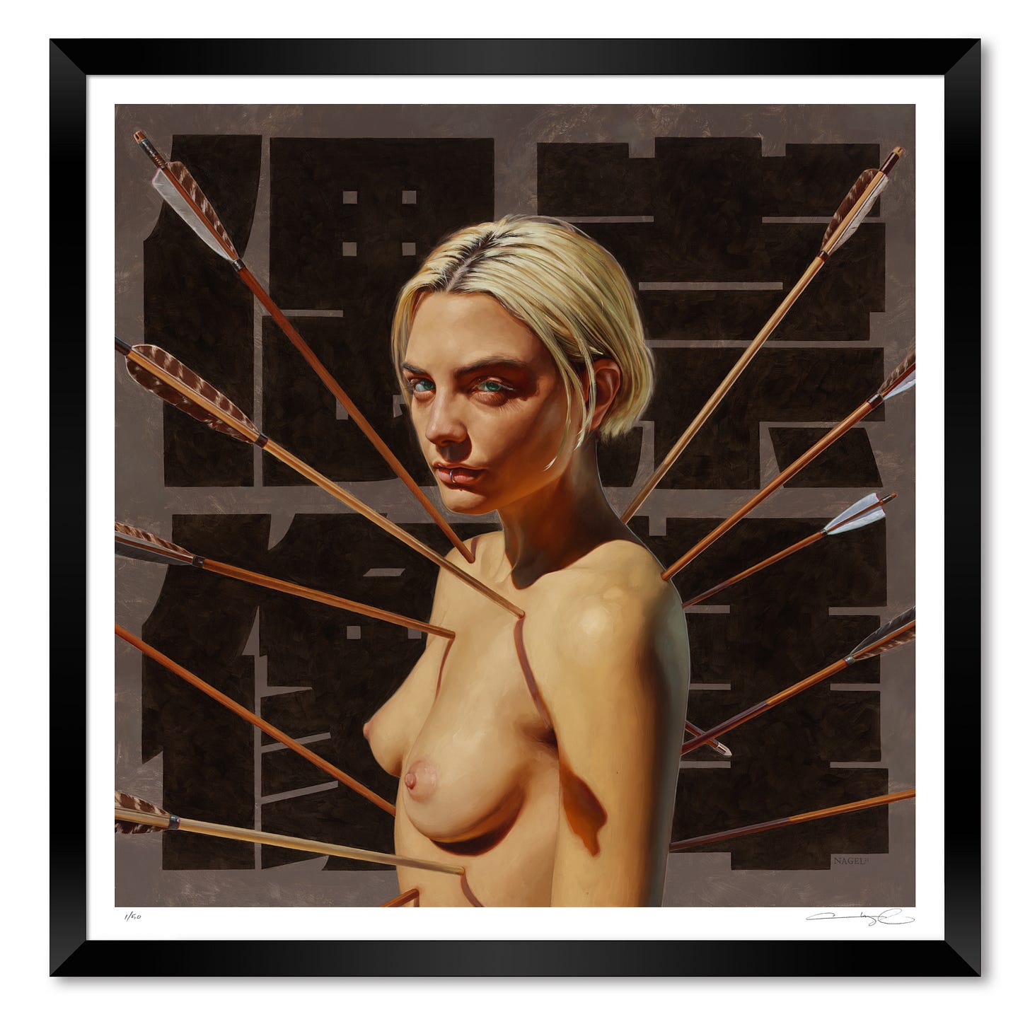
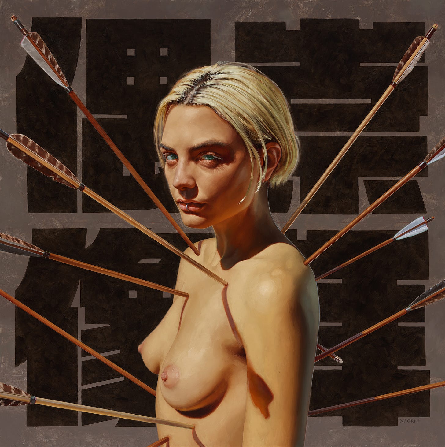
This Thursday, 2/22/24 — a date pleasingly packed with 2’s — I’ll be releasing a print edition of my painting, “Patron Saint of Turned Tables”. I painted this one for my show in New York last August, and while I often have a contentious relationship with past work, I still like this one quite a bit. I think it is successful in the things that are important to me in a finished painting [of mine], namely that it is essentially a portrait, but with a little…more. It’s simple and maybe a little vague in its meaning, and I think I did an ok job painting it. So I thought I would do a little post about the process of making this one.
This is going to be image-heavy and text-light. While I enjoy writing, something about delving too deep into one of my own paintings always leaves me feeling a little queasy. In a way, I painted it so I didn’t have to talk about it. But I digress...
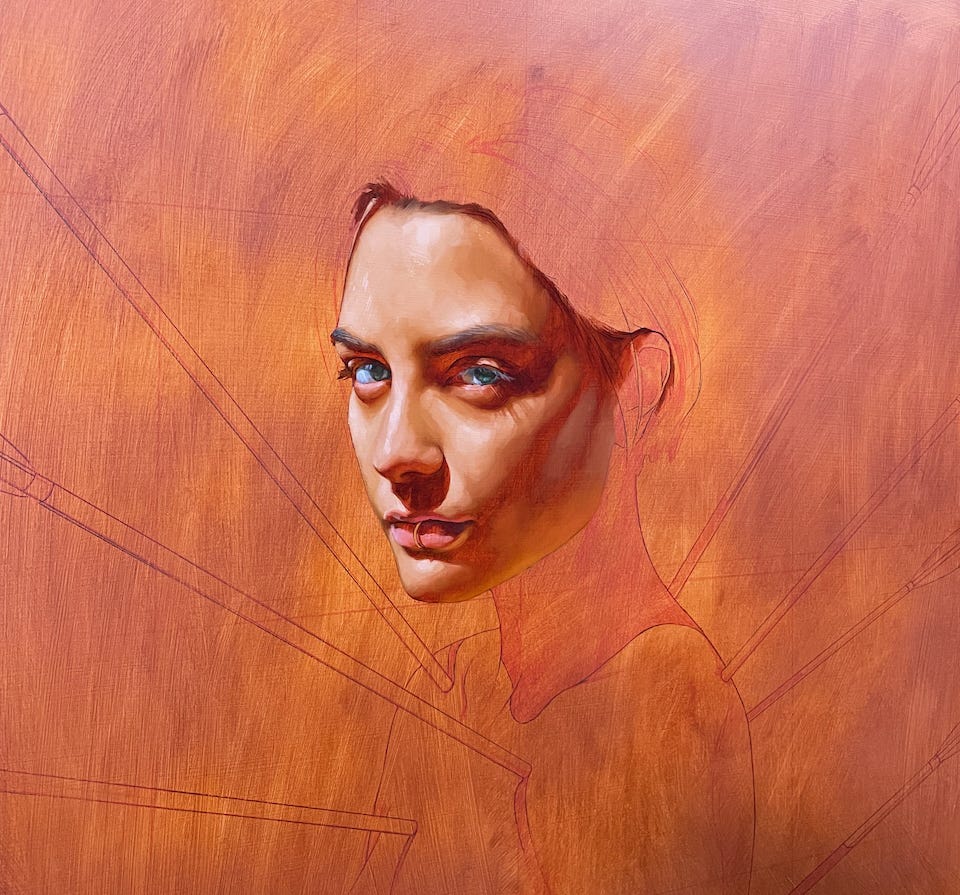
This is the end of my first day of underpainting. This initial layer is something I’ve only been doing for a couple years; essentially painting the entire figure once loosely, and then again as a much more rendered pass. I aim for a lot of transparency in the dark values here, and try and include only as much detail as necessary. I admit I have a tendency to over do it at this stage.
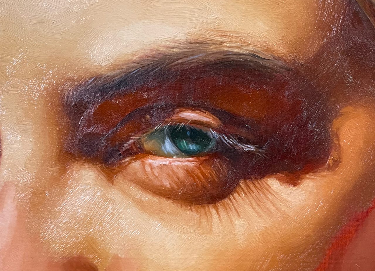
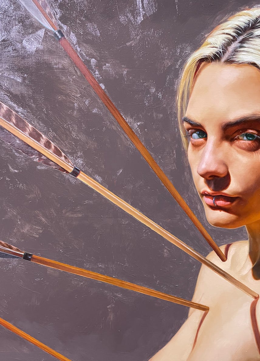
Here’s what that second pass looks like. My goal always is to paint realistically — use the reference, but not go too far into photo realism. I want as much detail as it needs, but it still needs to look like a painting.
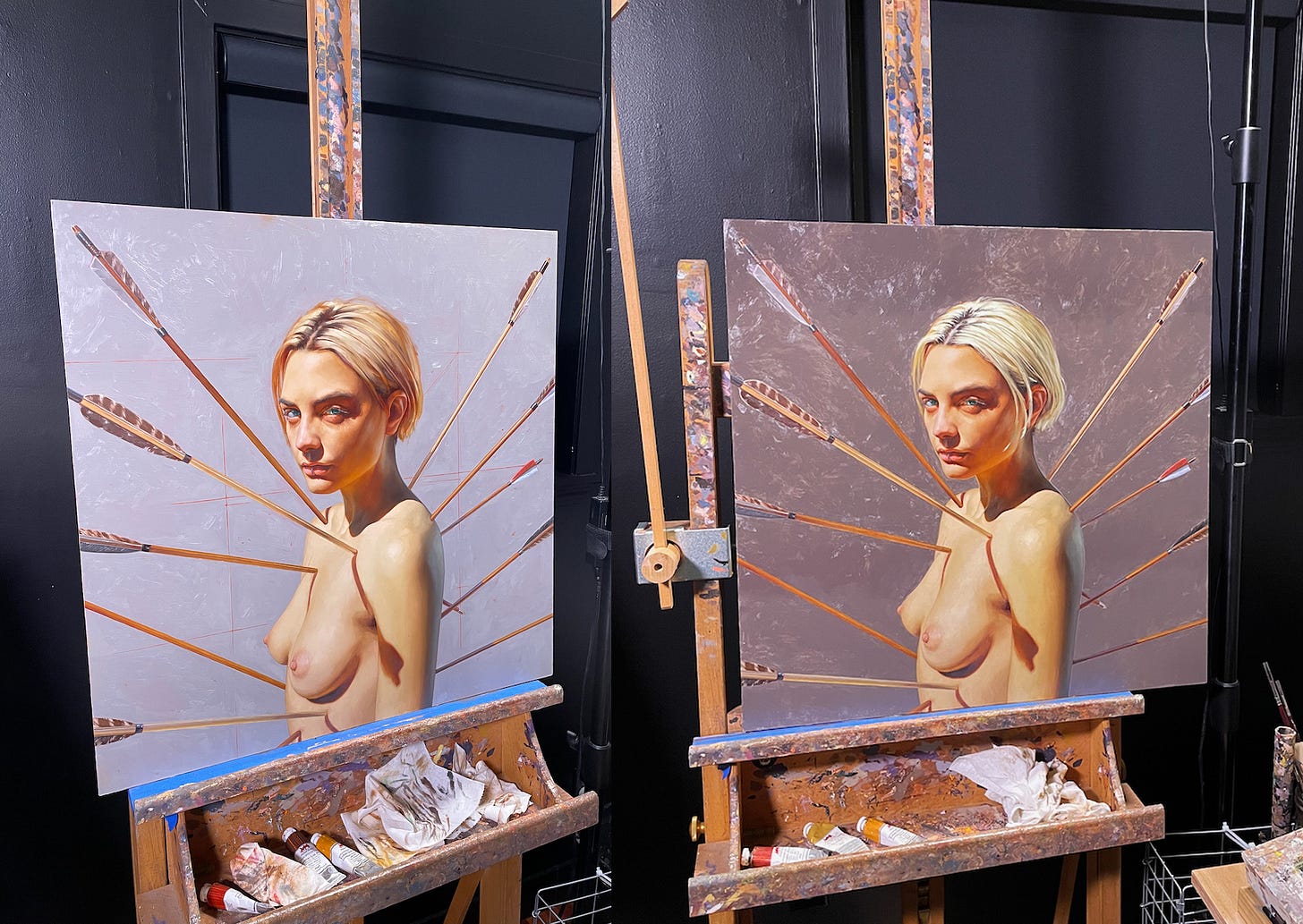
While I had the figure and arrows pretty well planned, I had less figured out for the background. I thought a lighter background would look more natural given that the subject is pretty clearly under direct light, but the contrast between foreground and background didn’t look great. A slightly darker tone let me bring in a little more warmth, build up a little more texture, and make the lighter parts of the figure seem brighter in comparison.
Once that new color was down, I finished the figure and arrows with no additional plans for the background. This is the detail work — nudging things into their place. This is by far my favorite stage of painting and I could work on a painting for months this way. [One of my goals as an artist is to get to a place where I can work on paintings for months and months without worrying about how practically stupid that is for business. Chipping away at a giant painting for a year or more would be lovely.]
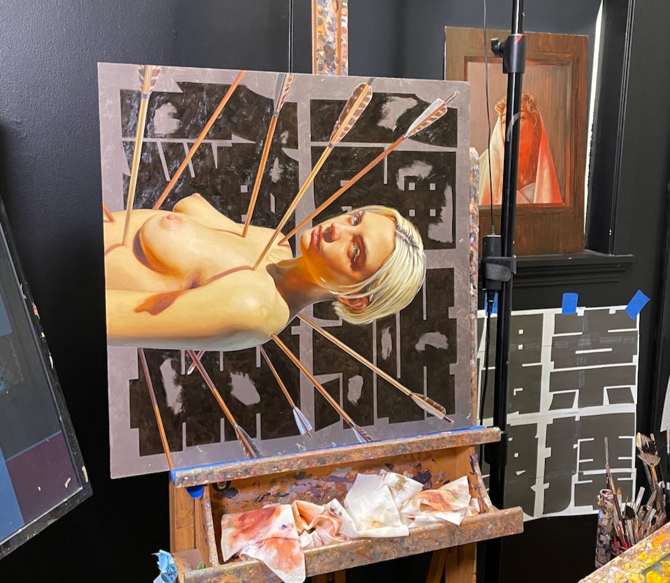
I then went on to work on other paintings. For months I couldn’t tell if this one was done or not, but it gradually began to look like it was missing something big. After a lot of photoshop work, I decided on these giant Japanese characters — rendered in possibly my all time favorite font.
Would it have been easier to have this planned from the start and painted before the figure? So much! It may look like just coloring in shapes, but all the edges have to be a little soft so it sits right with everything else. It comes through not at all in a tiny digital image, but you’ll have to take my word for it. [I don’t have to really say paintings look better in person right? It’s the perennial footnote provided by every artist in the digital age and we can’t help saying it over and over like it’s new news].
And there she is. Did you make it all the way through? Have I already been banned for nudity? We shall see.
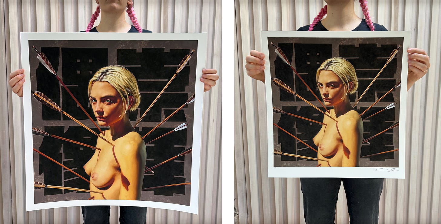
If you are so inclined, the prints we be available starting at 11am (pst) this Thursday, February 22. For the first time in a long while, I’m making two different sizes: a large format 24”x 24” and a smaller and more affordable 17”x17”. Both limited to 50 each, signed and numbered.
thank you friends.


Incredible and lifelike feel to this work. Sort of a strange and eerie dream like situation. I really haven't seen anything quite like this.
Striking ⚡️